Business Cards
Artist Statement: I didn’t want to go extremely detailed with my business card designs, but I knew there was a limit to how simple I could make them. I decided to try and stick to a blue color palette for my business cards as I didn’t want to try and commit too hard to both colors that I featured in my logos, blue and green. I feel like the constant clashing of colors would’ve hurt the designs more than helped them. I needed to commit to one and I chose blue because of how much better I imagined it would look, although I did make green the main focus of the second business card. The green, in my opinion, would’ve looked silly. I like all the designs with my favorite either being one of the first two designs. I don’t think I would ever actually produce a business card that looks similar to card design #3. If I absolutely had to pick a card design, I would probably choose the first one.


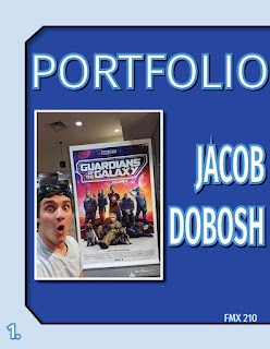
the mockup of the guardians poster is so good. your green on white business card also reminds me of green day's kerplunk album art
ReplyDeleteVery cool! The shapes of your textboxes and how everything is framed almost makes it look like it's for Guardians of the Galaxy (and that ties into the photo on your cover which is also cool). I think the blues worked out very well and overall it is very aesthetically pleasing.
ReplyDelete