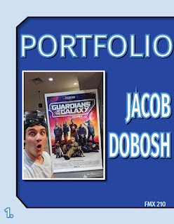
Alright, InDesign is pretty cool. This is easily one of the coolest things I have ever created and it took a lot of effort, and a lot out of me, but I finally did it. This is my portfolio of the best work I have created while in Digital Media for my first semester. I really like the color palette I went with, custom, I like the blues they just work so well for this. I liked that I decided to include geometric shapes on each page and I liked that I added the drop shadows to each of them, as well as the pieces themselves and the titles of each piece of artwork. It just adds a "pop" to the work that makes it really stand out. This was an awesome project and this was a helpful and interesting course that I took. Overall, I really like everything that is within this portfolio and the portfolio itself.
 I used the fifth spray from the downloads we were given to use, and I think it actually makes my custom spray look interesting. I like how custom it looks and I like how it fades at one point. This is by far one of the coolest things I’ve ever made using Photoshop. I also like how it looks like it is burned into a wooden surface. My favorite color out of these three here is probably the blue brush.


Comments
Post a Comment