Posts

Final Portfolio

Image
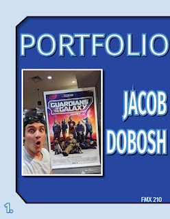
Alright, InDesign is pretty cool.  This is easily one of the coolest things I have ever created and it took a lot of effort, and a lot out of me, but I finally did it.  This is my portfolio of the best work I have created while in Digital Media for my first semester.  I really like the color palette I went with, custom, I like the blues they just work so well for this.  I liked that I decided to include geometric shapes on each page and I liked that I added the drop shadows to each of them, as well as the pieces themselves and the titles of each piece of artwork.  It just adds a "pop" to the work that makes it really stand out.  This was an awesome project and this was a helpful and interesting course that I took.  Overall, I really like everything that is within this portfolio and the portfolio itself.

Business Cards

Image
  Artist Statement: I didn’t want to go extremely detailed with my business card designs, but I knew there was a limit to how simple I could make them.  I decided to try and stick to a blue color palette for my business cards as I didn’t want to try and commit too hard to both colors that I featured in my logos, blue and green.  I feel like the constant clashing of colors would’ve hurt the designs more than helped them.  I needed to commit to one and I chose blue because of how much better I imagined it would look, although I did make green the main focus of the second business card.  The green, in my opinion, would’ve looked silly.  I like all the designs with my favorite either being one of the first two designs.  I don’t think I would ever actually produce a business card that looks similar to card design #3.  If I absolutely had to pick a card design, I would probably choose the first one.

Postcard

Image
  I downloaded a random file of times square and went with it being the subject of my postcard project.  These are the final designs.  I made the “Times Square” text different colors, red and white with a blue outline.  I even added a drop shadow and turned on the texture effect to make the letters seem more 3D.  I was skeptical of Indesign at first, but seeing that it can do this, and this is its main hook, I actually might use InDesign again in the future for uses outside this classroom.

ID H1

 https://www.youtube.com/watch?v=7VpAisbfldI Obviously, the text tool will be easy to use, using that to put text into my project to write down information for articles.  I think I'll use it mainly for that purpose and that's about it.  Unless I am able to stylize it a certain way, I will most likely be using it only for the article format only.  Other than that, I can't see myself spending much time in this program outside of class so I probably won't be needing to do anything elaborate in this program using the text tool.  I liked the length of this video, it's short and sweet and gets to the point. youtube.com/watch?v=0eqhUFRlvgI I think the stuff you can do with images and text at the same time is really helpful.  It saves a lot of time and effort.  I will, again, only use this information and tools however to aid my projects for this class whenever we use this software.  It's simply because I just at this point in time, do not have a really good purpose for

Animation

Image
I like seeing funny gifs online, especially gifs that have a funny twist to them.  I believe I have created a perfect example of this.  I didn’t want to make a gif that was based on another image.  I wanted to make my own meme.  Funny gifs are one of the most iconic parts of the internet and the randomness of this gif is something I really wanted to emphasize.  The colors are weird, the character is weird, and the whole piece is weird.  For those reasons, I like what I have created.

Somewhere

Image
I really tried to get the lighting to match up and I wanted to convey a tired and exhausted look with my pose.  I feel that I was able to get that, but could’ve maybe taken a few more sample pictures.  Overall I am pleased with how it turned out.  I played with the lighting for a while and I feel that that is the best I could get.
Image
 https://www.instagram.com/p/CJE80-pDRux/ This looks hard to do because of all the lumps in the blanket and getting the lighting on your face to match the lighting in the photo seems very difficult.  In order to make this look convincing, it is going to require a lot of time, patience, effort, and knowledge of photoshop. https://www.instagram.com/p/Co1vAXMNzve/ I think it would be really appropriate to photoshop myself in Hollywood because that's where I want to work for a living, so photoshopping myself to seem as though I'm actually there would be funny. I think this is just really funny and I think it's easy to create photoshop images where you are "trolling" someone else in the photo. I think this would be really fun to recreate because it's so easy and the end result looks fantastic.